After learning measure of central tendency (mean, median, and mode) and measure of dispersion (range, variance, and standard deviation) now is the time to understand the concepts for data distribution (percentiles, and quartiles).
Here, we'll demystify how data fits into the big picture.
1. Percentiles: Where You Stand in the Crowd 🎯
Percentiles split your dataset into 100 equal parts, helping you understand the relative position of a particular data point.
50th Percentile (Median): Half the data is below, half above. It's the middle point.
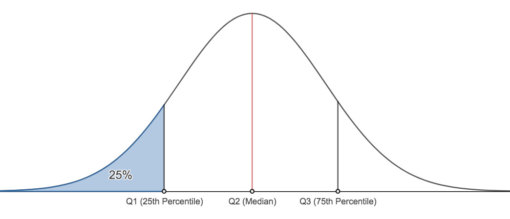
25th Percentile: One-fourth of the data is below; three-fourths above.
75th Percentile: Three-fourths below; one-fourth above.
2. Quartiles: Dividing into Quarters 🍰
Quartiles are simpler – they cut your data into four parts.
First Quartile (Q1): The 25th percentile. One-fourth of the data falls here.
Second Quartile (Q2): The 50th percentile or median. Half below, half above.
Third Quartile (Q3): The 75th percentile. Three-fourths below, one-fourth above.
When to Use Them?
Understanding Spread:
Percentiles help gauge where a data point stands relative to others.
Identifying Outliers:
They can reveal if a point is at the extremes or within specific quarters.
Comparing Performance:
Useful in various scenarios like exams, sports, or business metrics.
A Practical Example: Exam Scores 📝
Suppose you scored in the 85th percentile in an exam. That means you did better than 85% of your peers.
Quartiles add granularity – if you're in the third quartile, you've outperformed 75% of the group.
Conclusion: Your Data GPS 🌐
Percentiles and quartiles act as your data GPS, helping you navigate and understand where individual points stand in the grand scheme of your dataset.
Happy exploring! 🗺️📊


